Middlesex Community College

Project Summary
Middlesex Community College’s website was outdated and overloaded. After more than a decade of patchwork fixes, it had become an unwieldy repository of informationand, and needed a major overhaul. To address these challenges, I led a comprehensive redesign focused on user-centered design, accessibility compliance, and SEO best practices. The result is a streamlined, modern, and inclusive platform that aligns with the college’s mission and meets the real needs of students, faculty, and staff.
My Role
Lead UX Designer, I was responsible for guiding cross-functional teams through every phase of the project, from design to implementation.
I worked closely with content strategists, developers, and college stakeholders to ensure that every decision we made was aligned with our goals.
Problem
Internal audience focus
Overwhelming content volume
Poor navigation and usability
Lack of alignment with the college’s mission and values
Poor SEO
Goals
Content alignment with the college’s Mission
Prioritize forward-facing content
Provide easy navigation
Inclusive content that meets accessibility standards
Clean and modern look
Improve SEO score
Clear and optimized Information Architecture
The Process
Website Audit > Research & Ideation > Prototype & Design > Testing > Delivery
Website Audit
The audit identified 25 areas where MCC could make changes and improve the user experience. The main issues found were:
Student Stories & Diversity needed better integration.
Mobile Experience needed significant enhancement.
Navigation (Information Architecture) needed a complete rebuild focused on user engagement.
The website's search engine visibility was low.
Too much content was intended for internal users.
Inconsistent tone and messaging across the site.
Lacking alignment with the college’s brand and mission.
Poor user experience overall
Pages served both external and internal audiences, leading to confusion.
Approximately 75% of content was outdated, internally focused, lacked calls to action, or was used merely as a historical reference.

Research & Ideation
User research revealed that students' primary frustrations with college websites included difficulty finding major-specific information, unclear admissions guidance, and complex navigation.
They also struggled with limited details on program and career information, lengthy online forms, and a lack of engaging media like campus photos and videos.

Persona Study
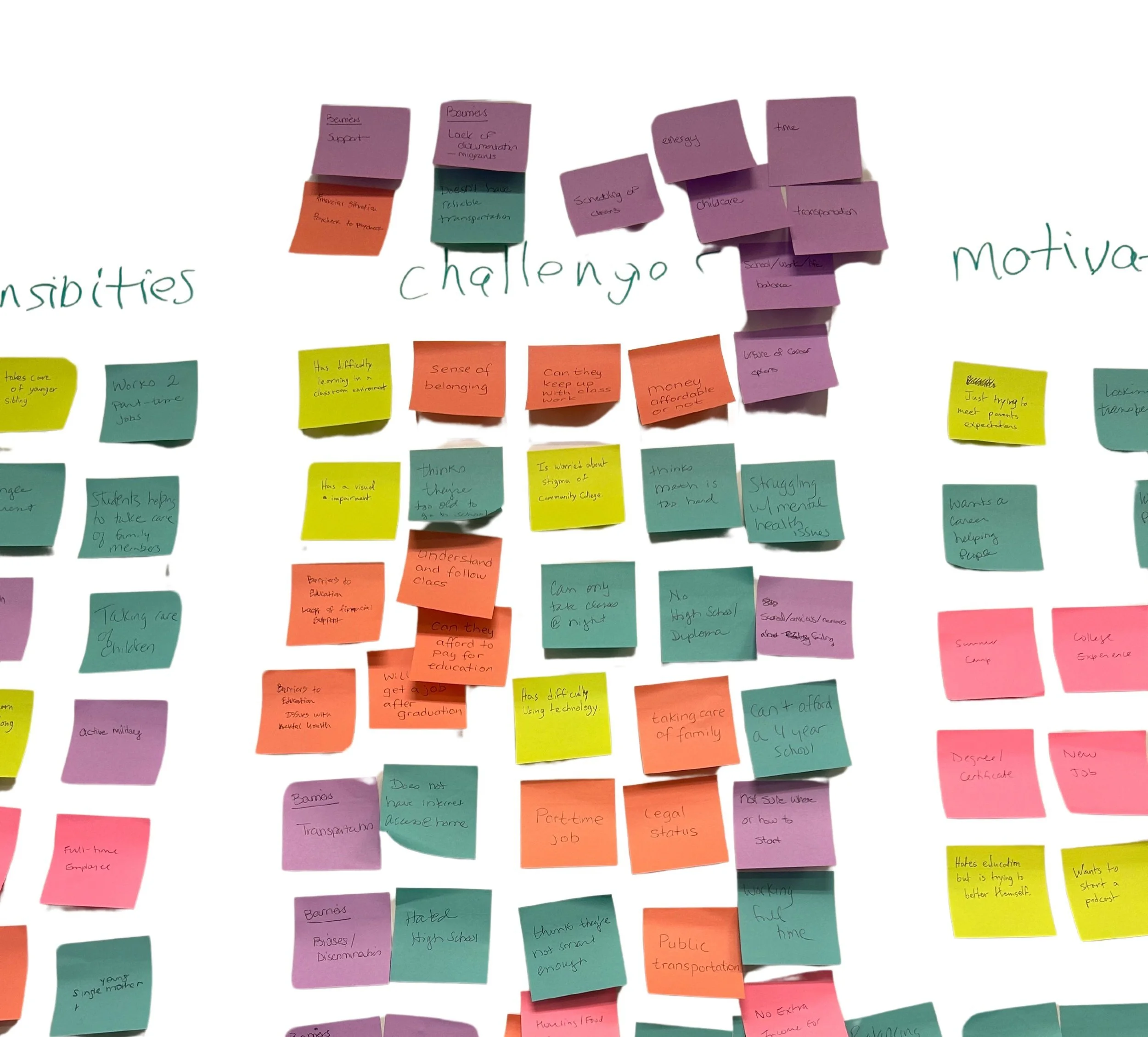
To ensure the new design aligns with the diverse student audience,
I teamed up with various college departments to develop loyal persona profiles. This collaborative effort allowed us to gather insights from different perspectives on who our students were. We also relied on data from our enrolled students to further refine these personas, ensuring they were grounded in real experiences and needs.
We found our audience to be diverse, encompassing first-generation students, dual enrollment participants, adult learners, seniors (60+), and traditional students. Each group with its own set of challenges and needs.

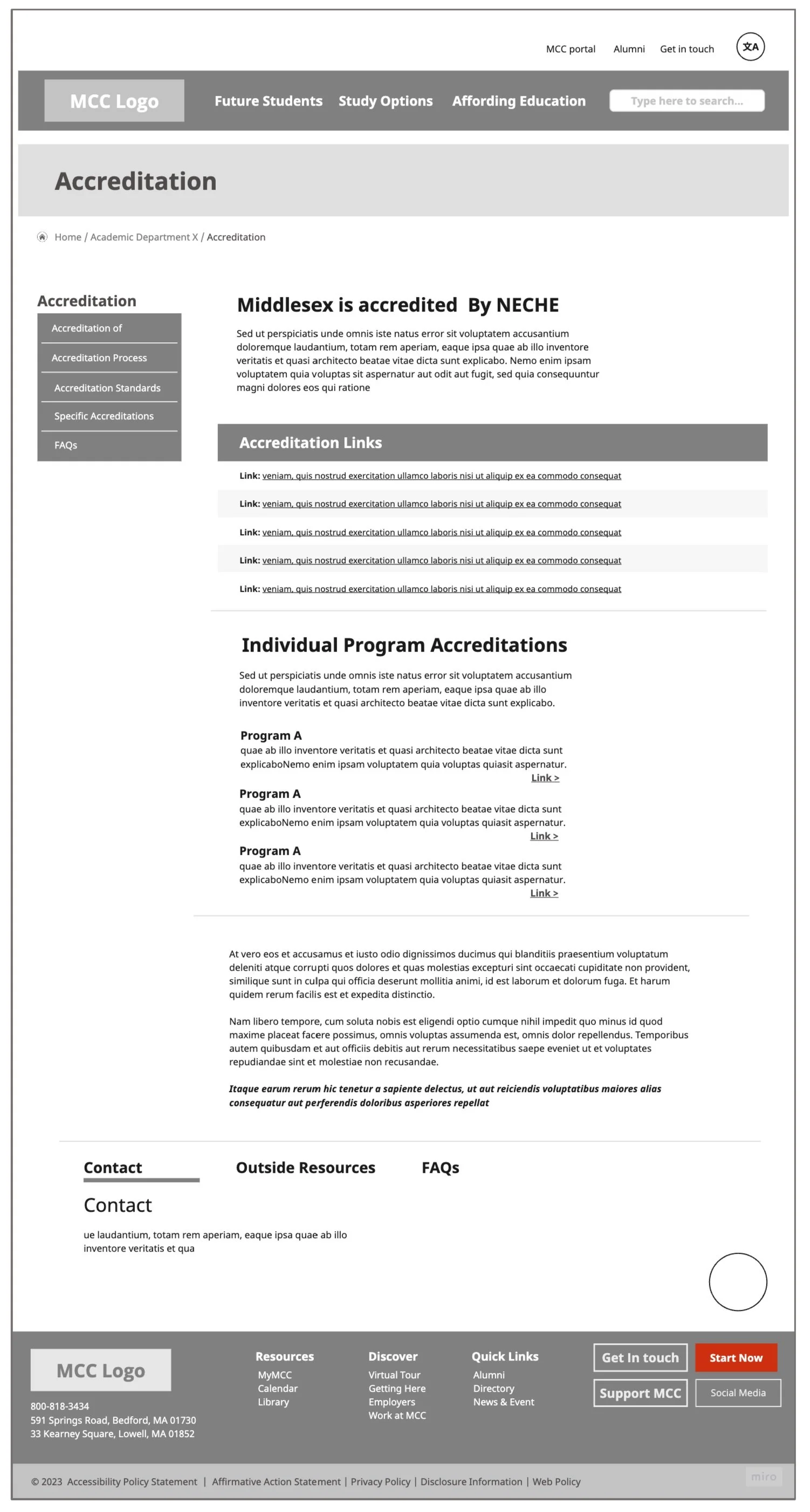
Prototype & Design
Based on our findings, I refined my design by focusing on an information architecture that delivers personalized content tailored to our diverse audiences, while adhering to best usability practices.
Using tools like Miro and Figma, I created wireframes that clearly conveyed the vision for our new pages. This approach led to positive and valuable feedback from the college community and vendors.


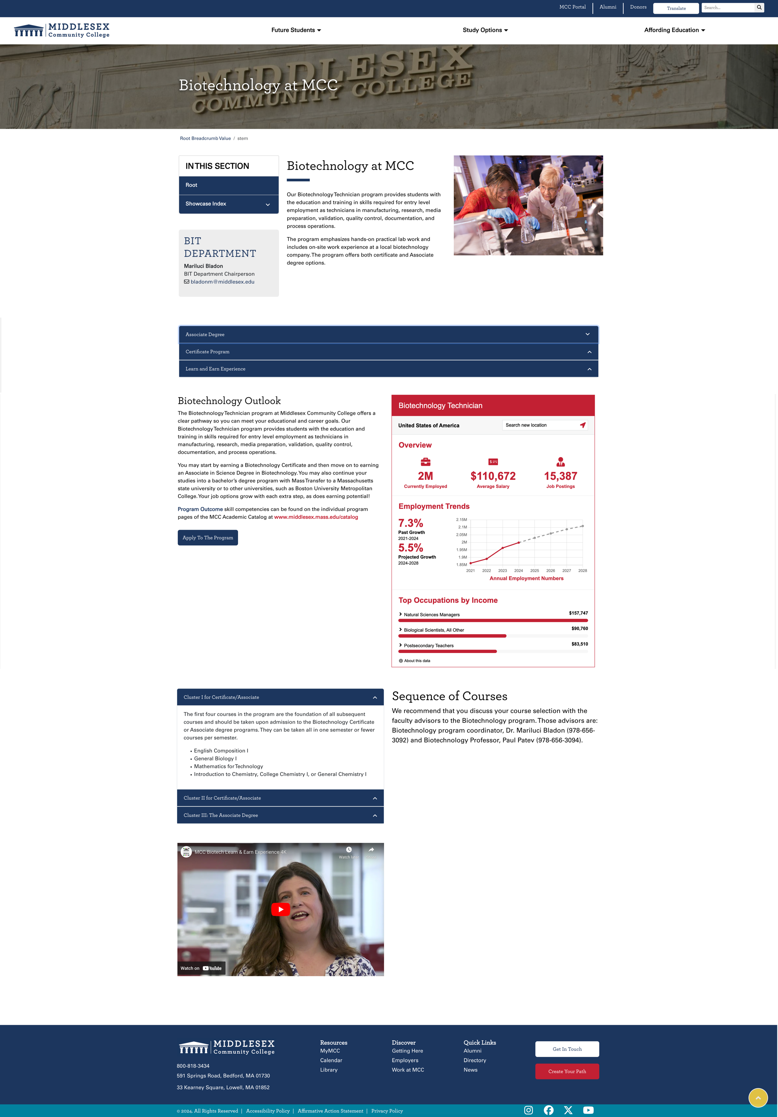
Delivery
The final product was a recruitment-focused website that reflected the College’s mission while meeting the needs of users with improved usability and accessibility.
The next step on this project will be redesigning internal content, with a commitment to continuous updates and ongoing user feedback to ensure the site remains effective and relevant.